
Keep tones for photographs and two tones for shapes
Many people call a grayscale photo “black and white,” but the pixels still contain many gray levels. In this guide, grayscale means a continuous 0–255 intensity range. Pure black and white means two visible outputs: 0 for black and 255 for white.
Choose grayscale when facial shape, fabric, clouds, shadows, texture, or soft edges carry the message. Choose pure black and white for a signature, stencil, form, simple logo, line drawing, or mask that must read as two clear regions. ImageMagick treats thresholding as direct color mapping and distinguishes it from dithering, which arranges two colors into patterns that suggest intermediate tones. [2]
Grayscale converts color into one brightness score
A useful grayscale conversion gives green, red, and blue different influence instead of taking a plain average. The imgrove tool calculates a Rec.709-style luma score as 0.2126R + 0.7152G + 0.0722B for each decoded 8-bit RGB pixel. ITU-R BT.709 defines the HDTV system behind these familiar luma coefficients. [1]
This quick browser transform is practical, not a full color-managed proofing conversion. It works on the browser-decoded RGB values. The result keeps equal red, green, and blue channel values for every visible pixel, while leaving the alpha value unchanged. Brightness moves the score up or down; contrast spreads or compresses values around the midpoint.
A threshold collapses every gray into black or white
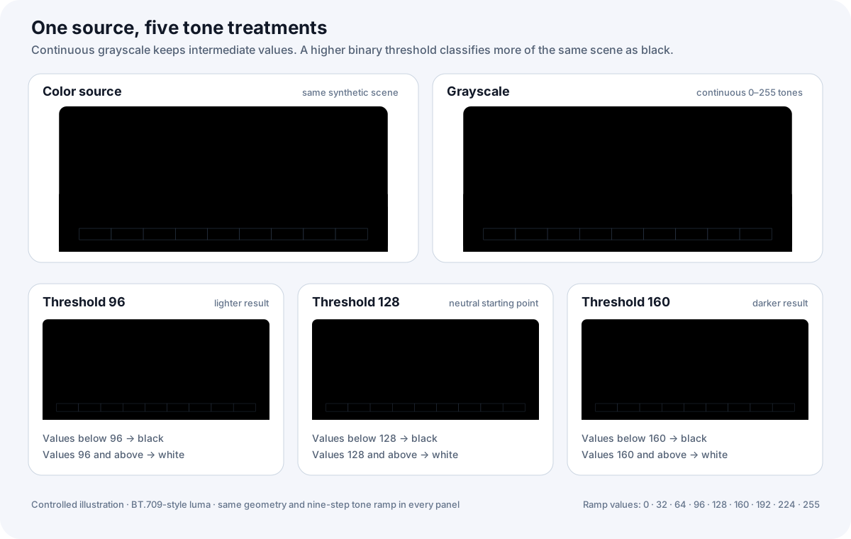
After tone adjustment, the threshold rule is simple: a value below the cutoff becomes black, and a value at or above it becomes white. At the default cutoff of 128, a value of 127 becomes black and 128 becomes white. ImageMagick describes thresholded channels as Boolean or on/off values and notes that a one-level posterize operation selects two colors. [2]
Raise the cutoff from 128 to 180 and the values from 128 through 179 switch from white to black, so the image gains black area. Lower the cutoff and more pixels become white. The imgrove preview reports the measured black-pixel share, which turns this from a vague filter label into a result you can compare.
See the same source across five tone treatments
Use three questions to choose and tune the mode
First ask whether the reader needs tone or only shape. Second, check whether pale details must remain visible. Third, inspect the final image at its real display or print size. If tone carries meaning, start with grayscale. If shape carries meaning, start with pure black and white at 128.
Use the imgrove Black and White Image Converter to test both modes locally. For a faint signature, add contrast and raise the threshold until the strokes connect without filling the paper texture. For a portrait, keep grayscale and use small brightness or contrast moves so highlights and shadow detail stay readable. Invert only when the destination needs light marks on a dark field.
Export a PNG copy and keep the source
PNG supports grayscale, truecolor, optional alpha, and lossless raster storage. [3] The imgrove tool exports a PNG at the original pixel dimensions and preserves decoded transparency while it changes visible RGB values. It does not add detail to a soft or small source.
The browser serializes a new file from the canvas bitmap. [4] Source EXIF, IPTC, XMP, animation, and container-specific data do not carry into that new PNG. Keep the original, verify thin lines and shadow detail in the downloaded copy, and repeat with a different threshold when the destination changes.
Grayscale vs pure black and white at a glance
| Decision | Grayscale | Pure black and white |
|---|---|---|
| Visible tones | Black, white, and intermediate gray values | Black and white only |
| Keeps | Gradients, texture, faces, shadows, and soft edges | Clear regions, strokes, silhouettes, and hard edges |
| Main control | Brightness and contrast | Brightness, contrast, and threshold cutoff |
| Best starting point | Photographs, shaded artwork, and textured scans | Forms, signatures, masks, stencils, and line art |
| Main risk | Weak contrast can look flat | A poor cutoff can erase thin marks or fill shadows |
Choose grayscale when
- Faces, texture, gradients, or shadow detail must remain visible
- The image should look photographic rather than graphic
- You want a neutral preview before making a harsher two-tone copy
Choose pure black and white when
- A form, signature, stencil, mask, or line drawing needs two tones
- The destination values crisp shape more than subtle shading
- You can inspect and tune the threshold for the actual source
Try the conversion and check the output
Related imgrove tools
Compare both tone modes on your own image
Convert one JPG, PNG, or WebP locally. Tune brightness, contrast, threshold, and inversion, then download a PNG and review the reported black-pixel share. Use the feedback link below to share the source type and result you expected.
Try Black and White ConverterTry the workflow and tell us what worked, what failed, or what needs clearer guidance: hi@imgrove.com.